Overview
A self-initiated UX/UI case study focused on simplifying the flight deals search experience. I developed this case study during a redundancy period, using the time to sharpen my skills and explore new design approaches. The goal was to reduce friction and help users quickly find deals and book through third-party platforms.
The Problem
Finding affordable flights online can be frustrating. Many aggregator sites are cluttered with upsells, hidden fees, and too much information. Air Hustle aims to fix this with a clear, trustworthy platform for budget-conscious travellers who value price, simplicity, and transparency.
Identified pain points
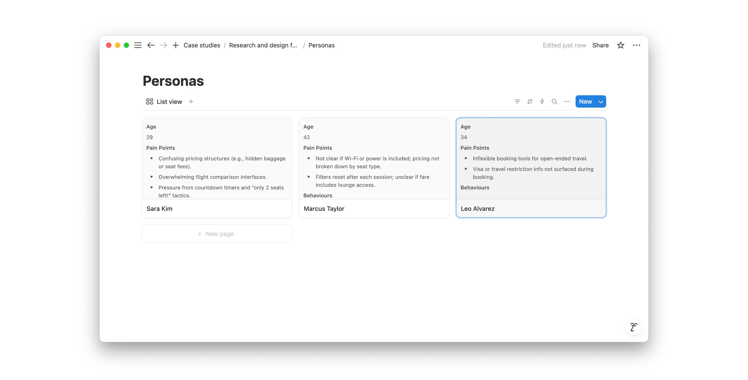
- Confusing pricing structures (eg hidden baggage or seat fees).
- Overwhelming flight comparison interfaces.
- Pressure from countdown timers and “only 2 seats left!” tactics.
- Hidden information (does flight have wi-fi etc).
- Inflexible booking tools for open-ended travel.
- Visa or travel restriction info not surfaced during booking.
Goals
- Keep UI simple and easy to use.
- Avoid sales pressure tactics.
- Show price up front.
- Have options to show flights for power users.
Process
Research
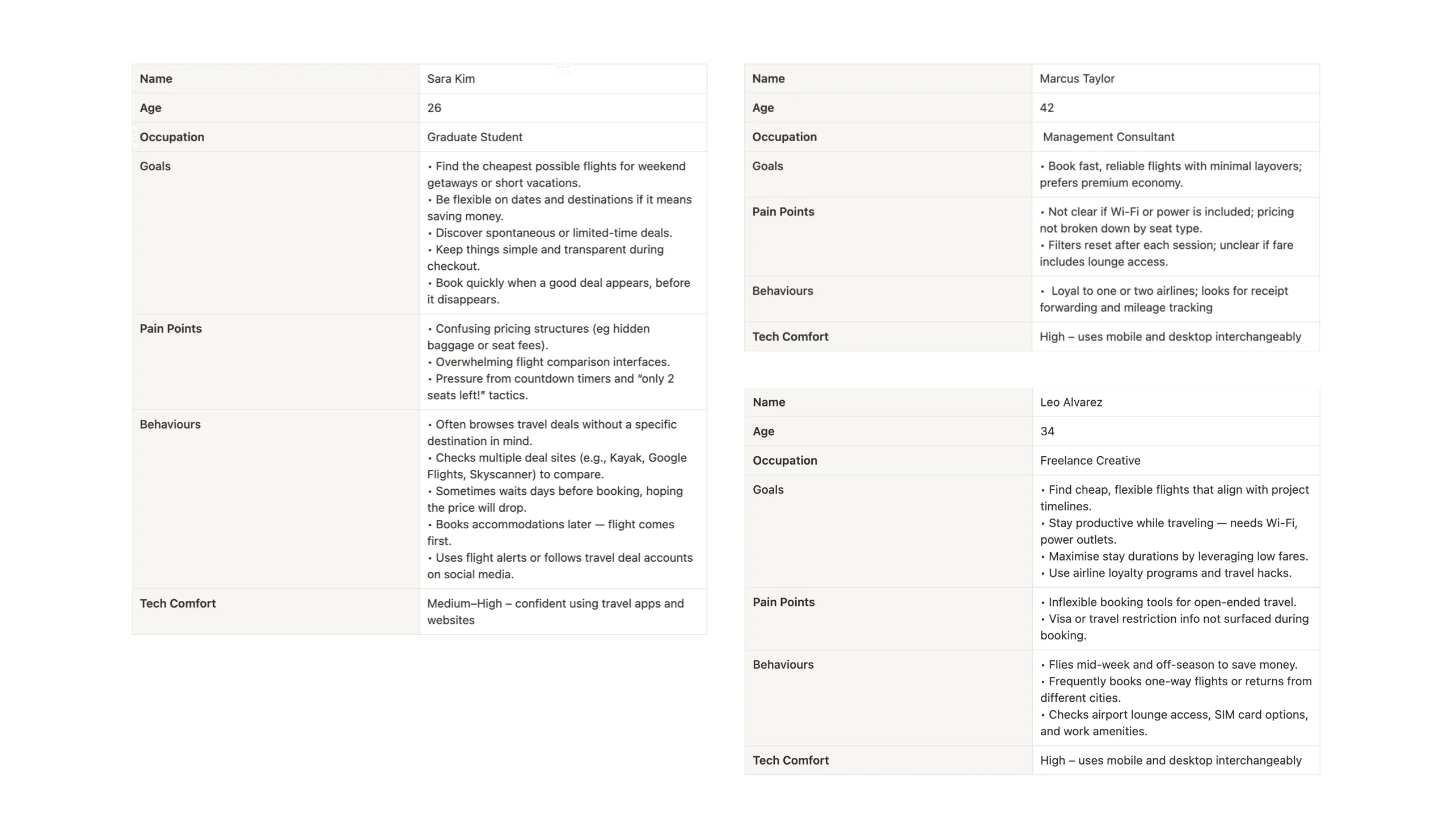
To better understand user needs and pain points, I developed three user personas based on distinct travel behaviors. While these were created using assumed data for this case study, in a real-world scenario, they would be informed by qualitative and quantitative user research.
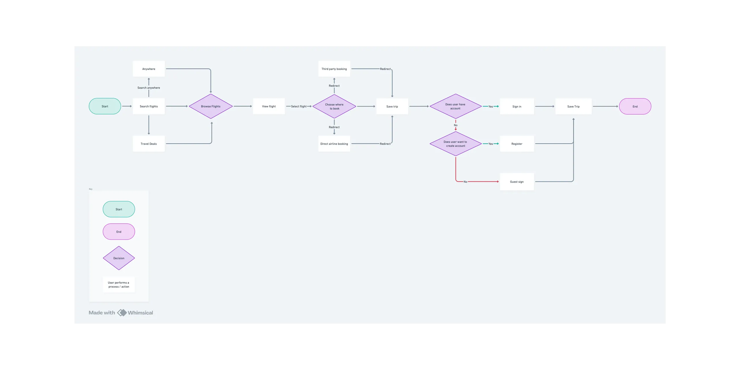
With the personas in place, I created a user flow to visualise the key steps users take from landing on the site to selecting a deal and being redirected to a third-party booking platform.
I then mapped each persona’s journey through the search and booking process to identify key frustrations, motivations, and opportunities for improvement.
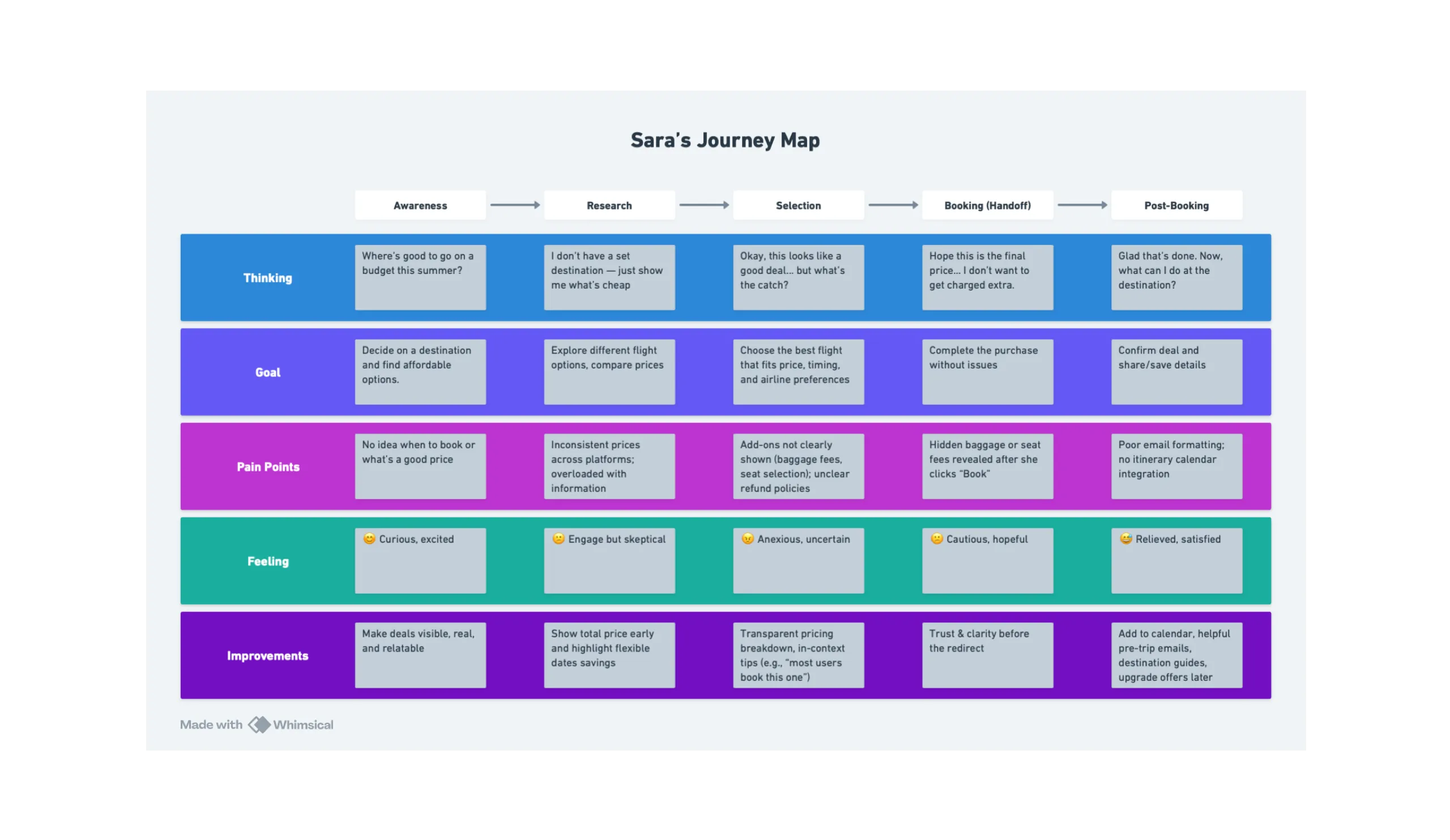
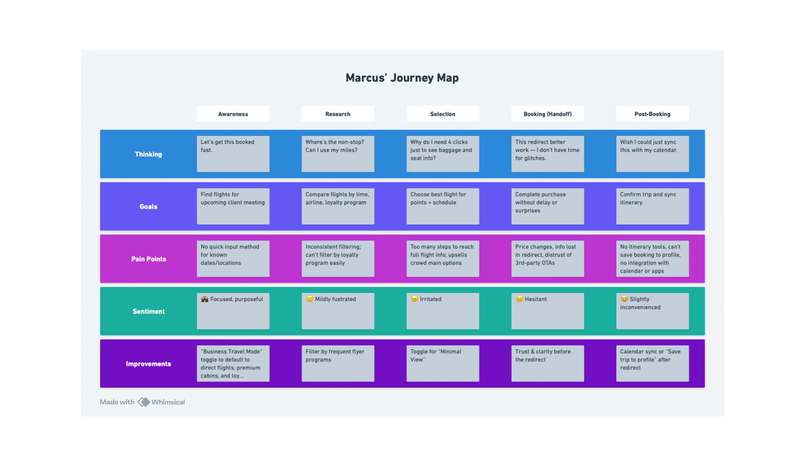
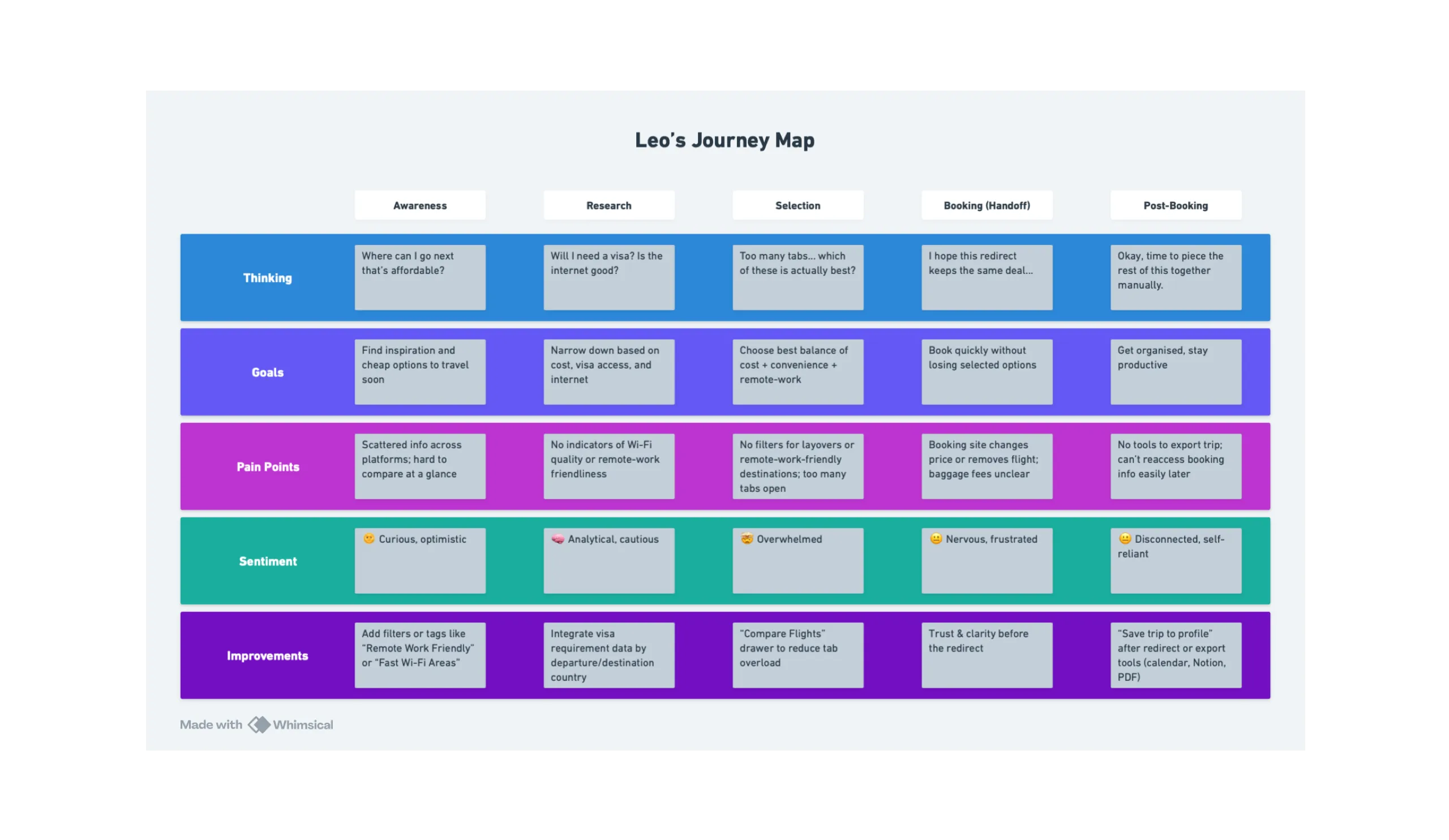
A common theme between the users is that the fights tend to have hidden baggage or seat fees so I will try to add transparent pricing or tooltips to reveal the prices.
Exploring Designs
To begin visualising the UI, I created wireframes in Whimsical.
These wireframes were kept simple, emphasising layout. The goal at this stage was to quickly try out layouts for key elements such as the search bar, filters, and flight results, without getting distracted by styling details. Inspired by established platforms like Kayak and Skyscanner. These early wireframes helped identify opportunities to improve usability and guided the next phase of iterative design.
Style Guide
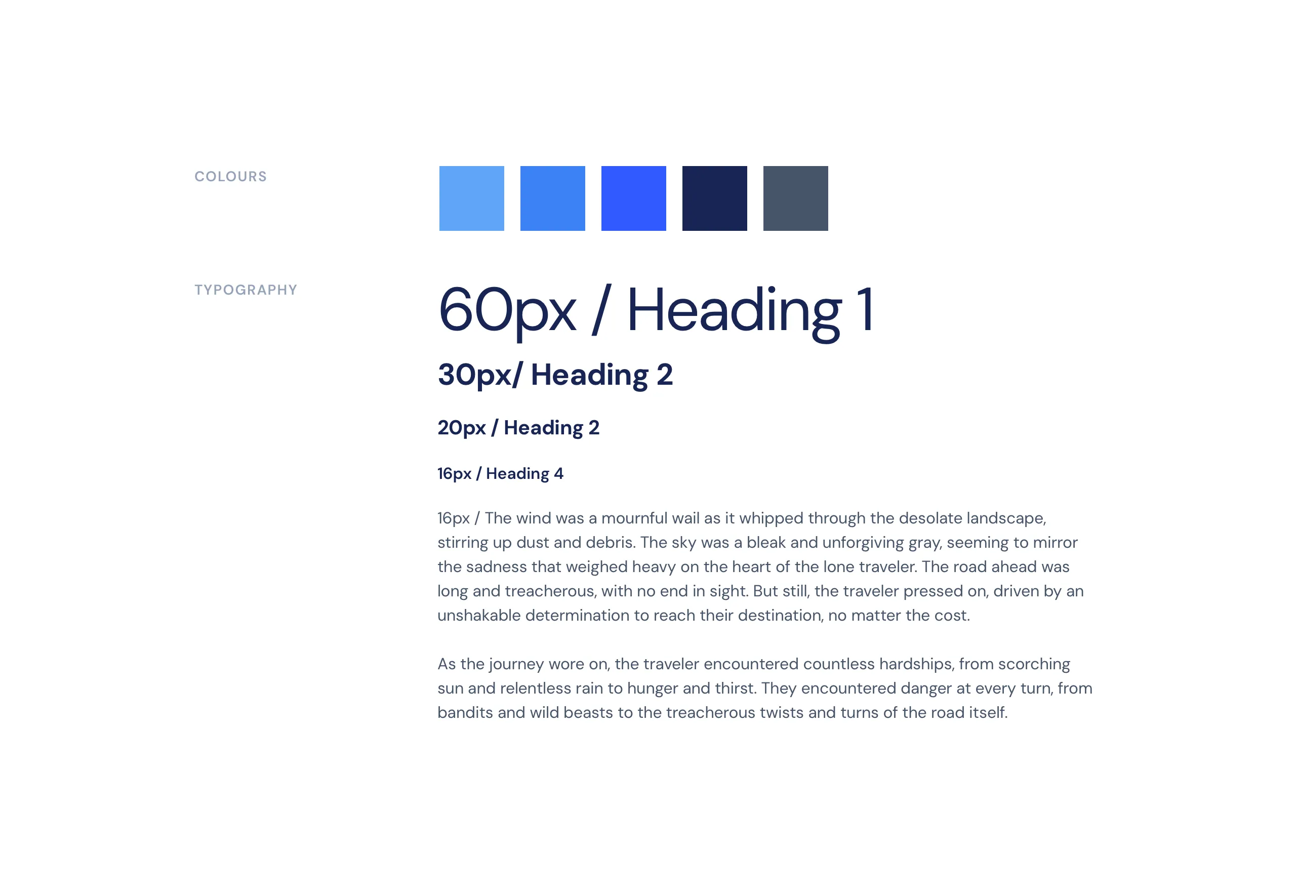
For typography, I used DM Sans for its simple, geometric, and modern style. It feels fresh and approachable an ideal fit for a flight deals aggregator with a diverse user base. It has a nice balance between being professional and welcoming, which helps build trust without feeling too corporate or cold.
I chose blue as the primary color because it’s non-intrusive and calming—making it a solid foundation for interfaces that users interact with regularly. It’s also colorblind-friendly, which helps improve accessibility for a broader range of users.
To allow more flexibility, I included a typographic scale in the style guide rather than assigning fixed weights to headings.
I developed high-fidelity mockups from the wireframes, applying a 4px vertical spacing system for visual consistency. I also ensured buttons were at least 40px tall to meet accessibility standards and support ease of interaction across devices.
Refining Designs
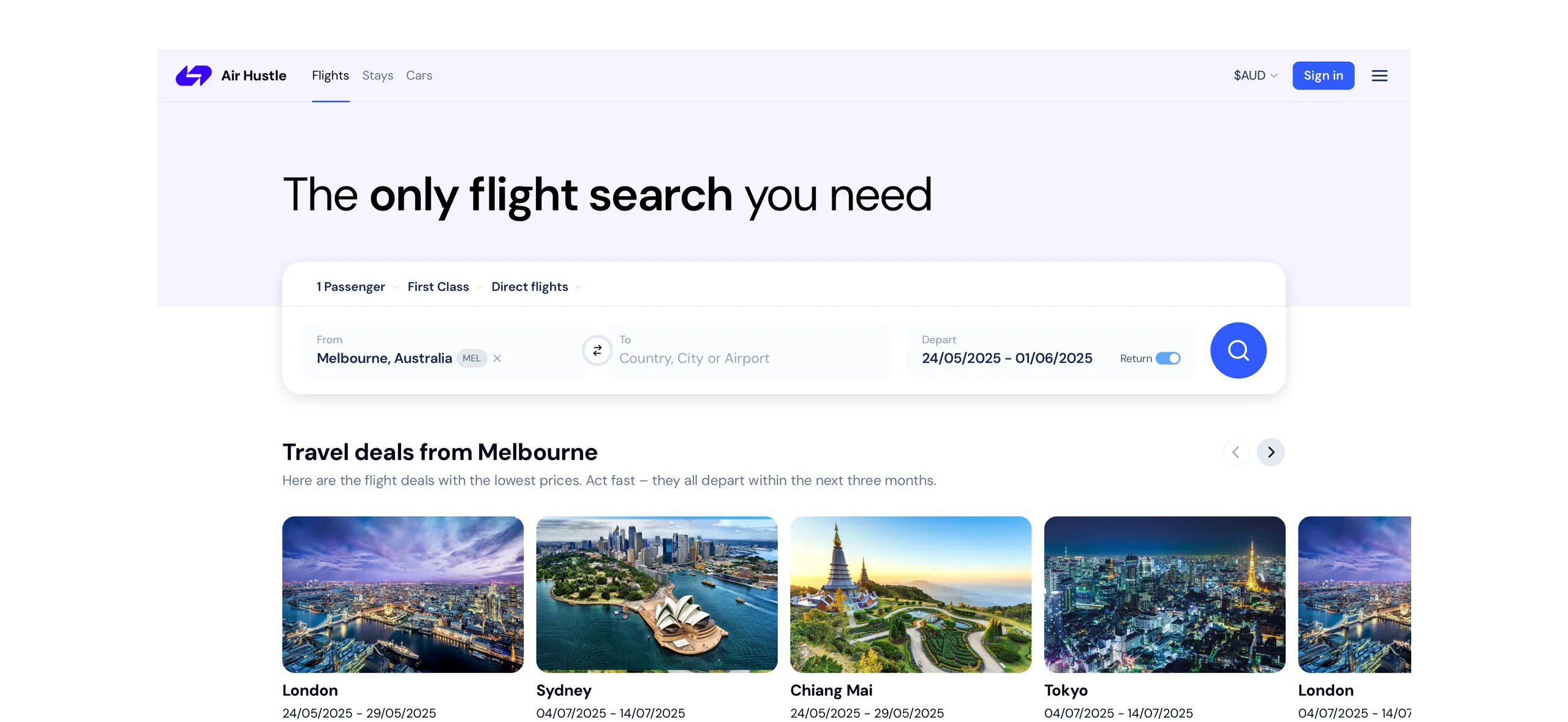
Since search is the most important feature of a flight deals site, I made it more prominent by visually separating it from the background, breaking it out of the hero and adding a shadow for emphasis.
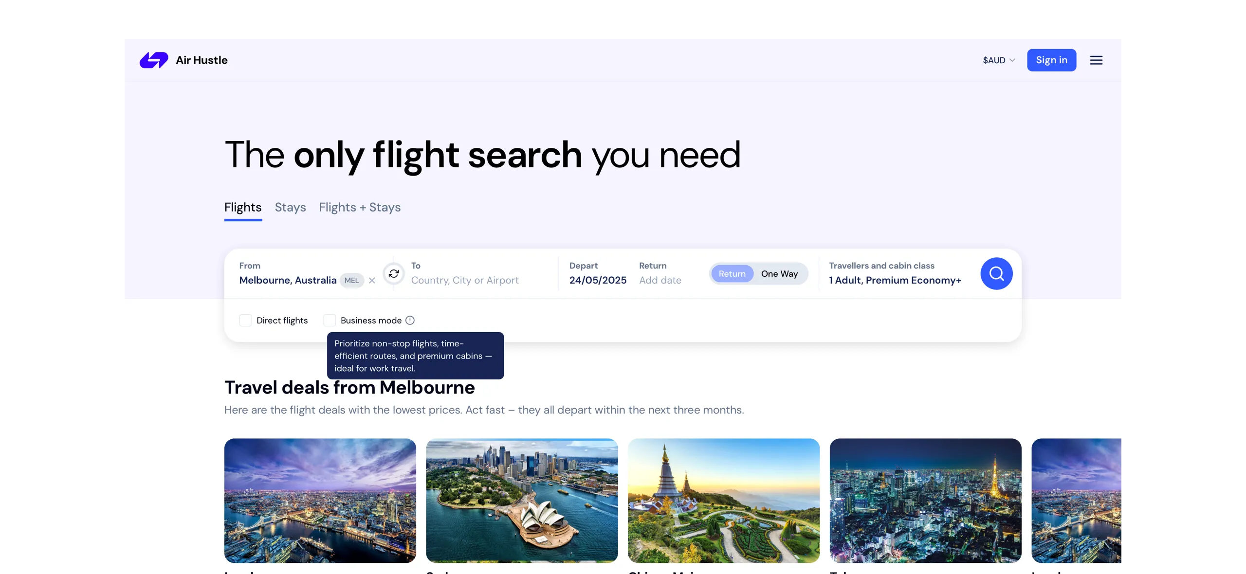
Reviewing the design:
- The search look cluttered due to the spacing between inputs
- The return date toggle appeared visually off
- The to/from switch icon resembled a refresh symbol
I made some tweaks with the above feedback in mind. As this is a self-initiated project, I haven’t done formal user testing, but my decisions are based on usability best practices.
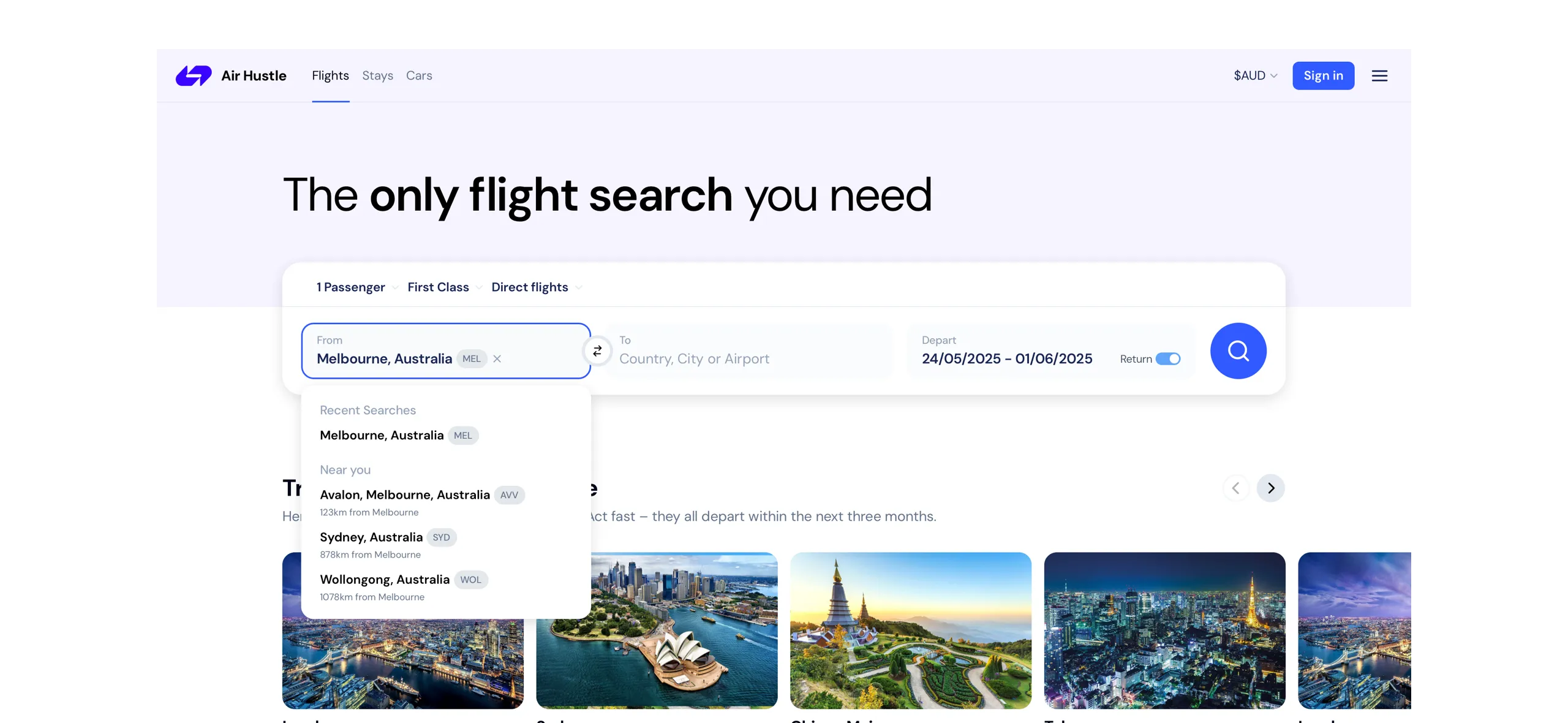
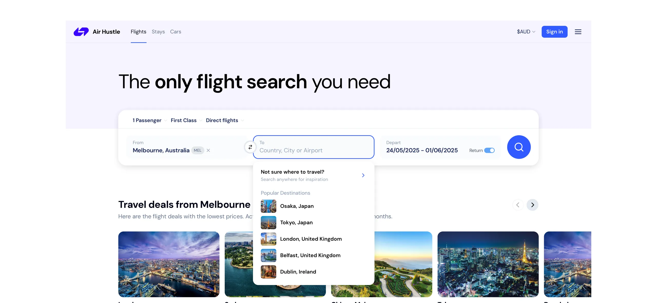
To make the search more intuitive, I added location-based auto-suggestions using the user’s IP address so users can quickly select a location. Additionally, I included recent searches to support power users with faster access to frequently used locations. While populating the from destination with popular destinations for people unsure where to go.
I structured the exploration flight cards with the F-shaped scanning pattern in mind, placing key details where users’ eyes naturally land first.
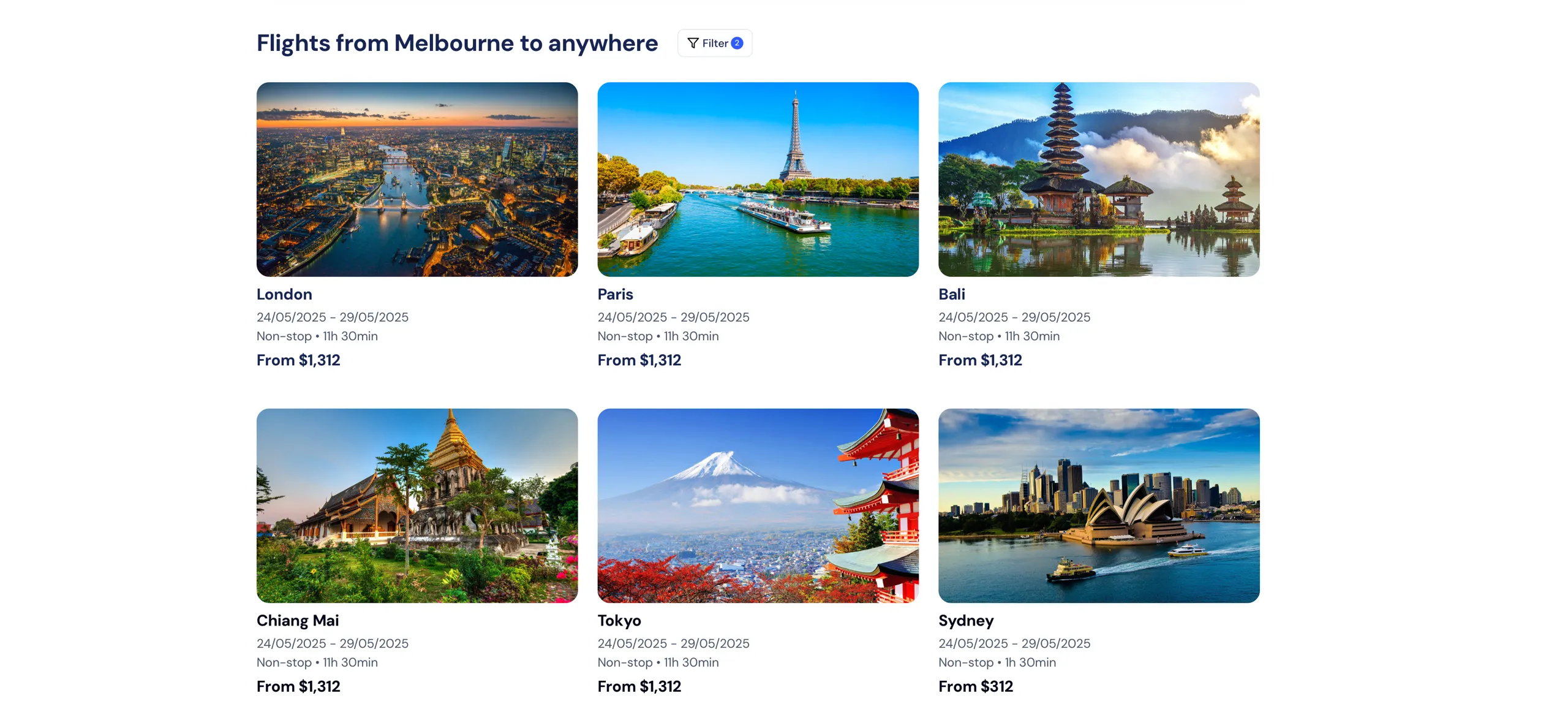
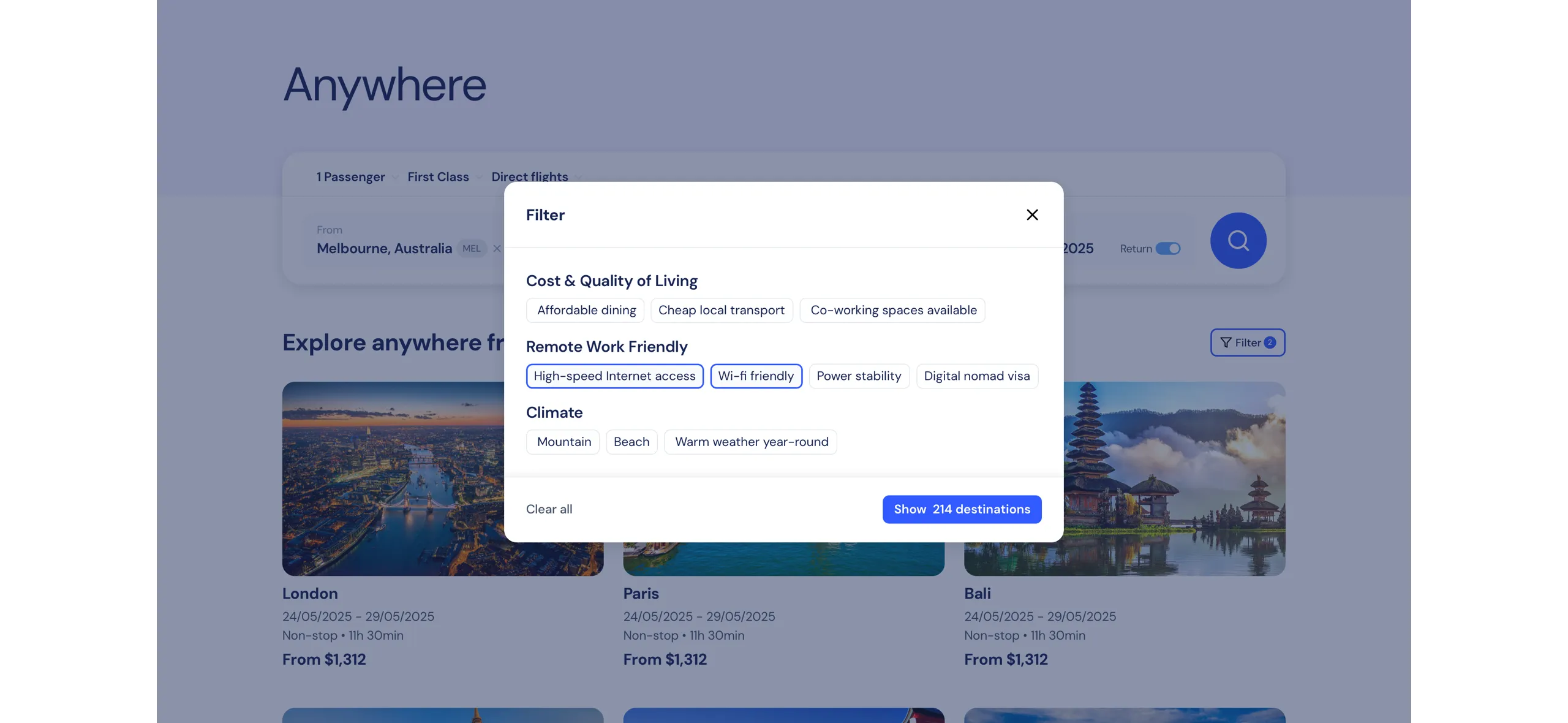
The fly anywhere filter menu helps users easily explore destinations that match their travel interests.
I’ve kept the search minimal on the results page to maximize space for flight listings, but it will expand when clicked.
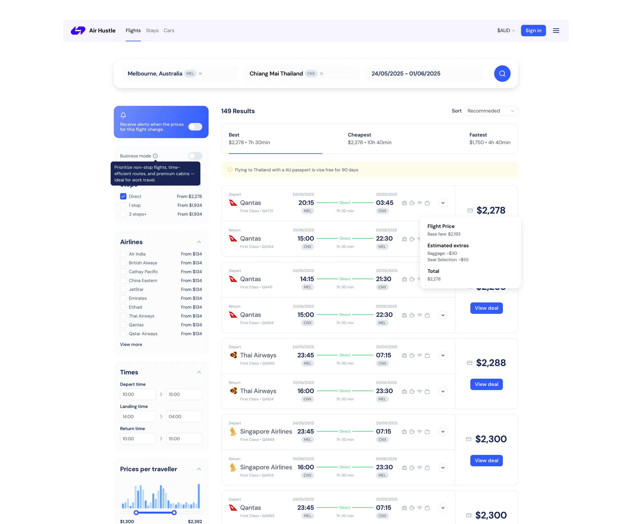
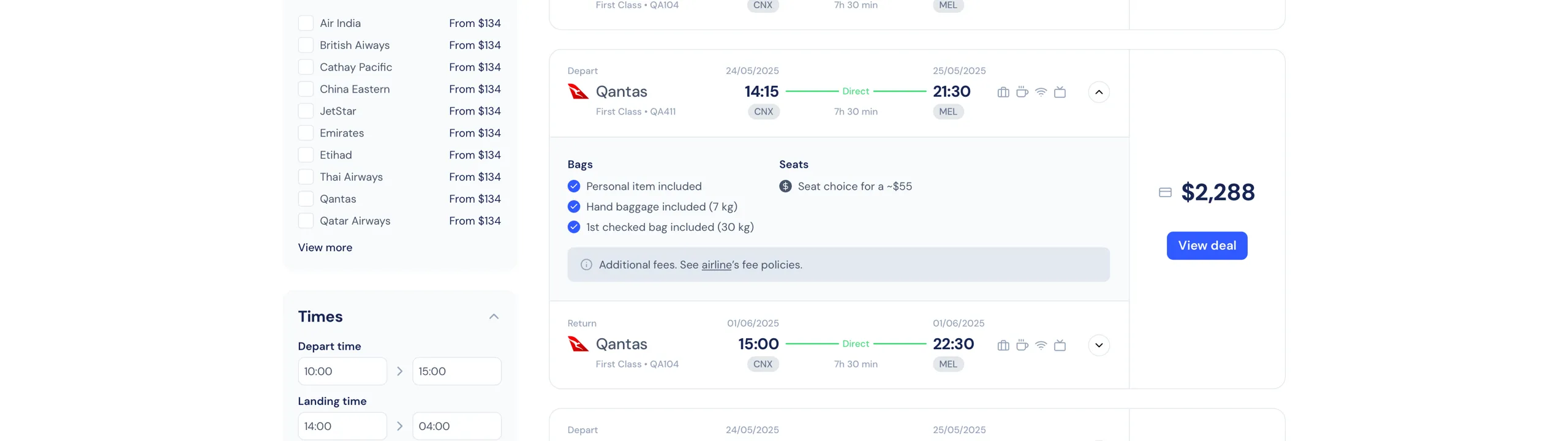
Due to the UI being quite busy on these results pages I added a button to reveal more details for the flights to highlight any hidden costs, such as seat selection fees or checked baggage charges.
Although this self-initiated case study didn’t involve live user testing, I based design decisions on heuristics, competitor patterns (like Kayak and Skyscanner), and common usability principles.
See the full mockups below:
What I learned
In a real-world scenario, to improve the flight deals search experience, usability testing would concentrate on how easily users navigate the search filters, interpret and interact with results, and complete the booking process through third-party platforms.
To ensure a seamless and effective flight search experience, I would focus on tracking metrics such as:
- Task Completion Rate - % of users who successfully complete the entire flow (search → explore → select → book) without dropping off.
- Abandonment Rate - Where users leave the flow (eg after search, during selection, before booking). This helps identify friction point.
- Conversion Rate - Number of support tickets related to the flight booking process—high numbers might signal UX issues.