Overview
Redesigned Vero 2.0’s settings area over 8 weeks (originally scoped for 6) I led the end-to-end redesign. Our team of 5 (Head of Product, Product Designer, and 3 Engineers) with resources constraints had to move fast to close key feature gaps and remain competitive.
Using Sketch for design and React for development, we focused on reducing confusion between different setting types while improving overall usability, consistency, and scalability.
Impact
As a result of releasing the redesign settings, support requests related to user-level and project-level settings decreased, contributing to less customer frustration.
The Problem
The settings experience in Vero 2.0 was disjointed and unintuitive. Users struggled to find and manage settings related to projects and user preferences. With no clear structure, it was easy to get lost especially as the platform scaled.
To understand the key challenges, I collaborated with the Head of Product, who provided product goals and insights gathered from the customer and success teams.
Pain Points
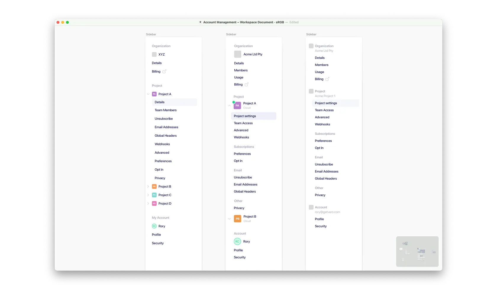
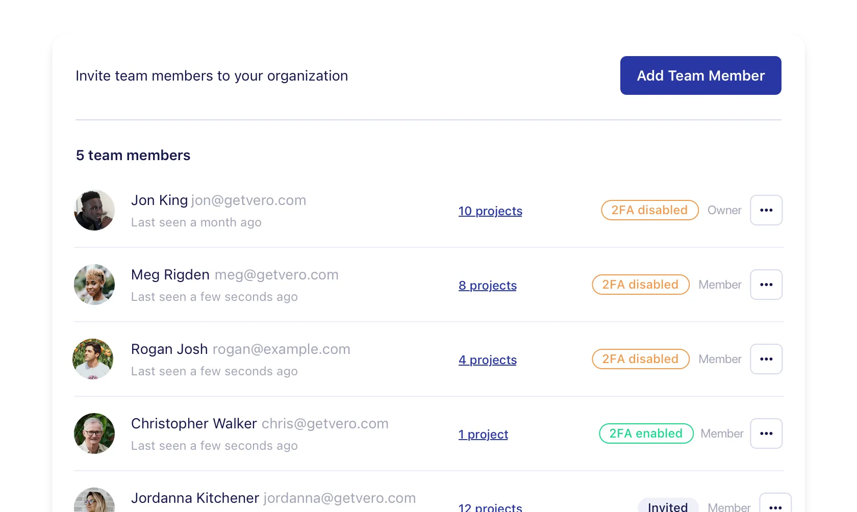
- There was no clear distinction between user-level and project-level settings, causing confusion around which settings affected what.
- As more settings from Vero 1.0 are integrated into Vero 2.0, the lack of hierarchical clarity is becoming increasingly problematic.
- Users can’t customise their user profile by adding an image.
- The concept of an organisation layer introduces a new level of complexity, with no existing structure to support organisation-specific settings.
Goals
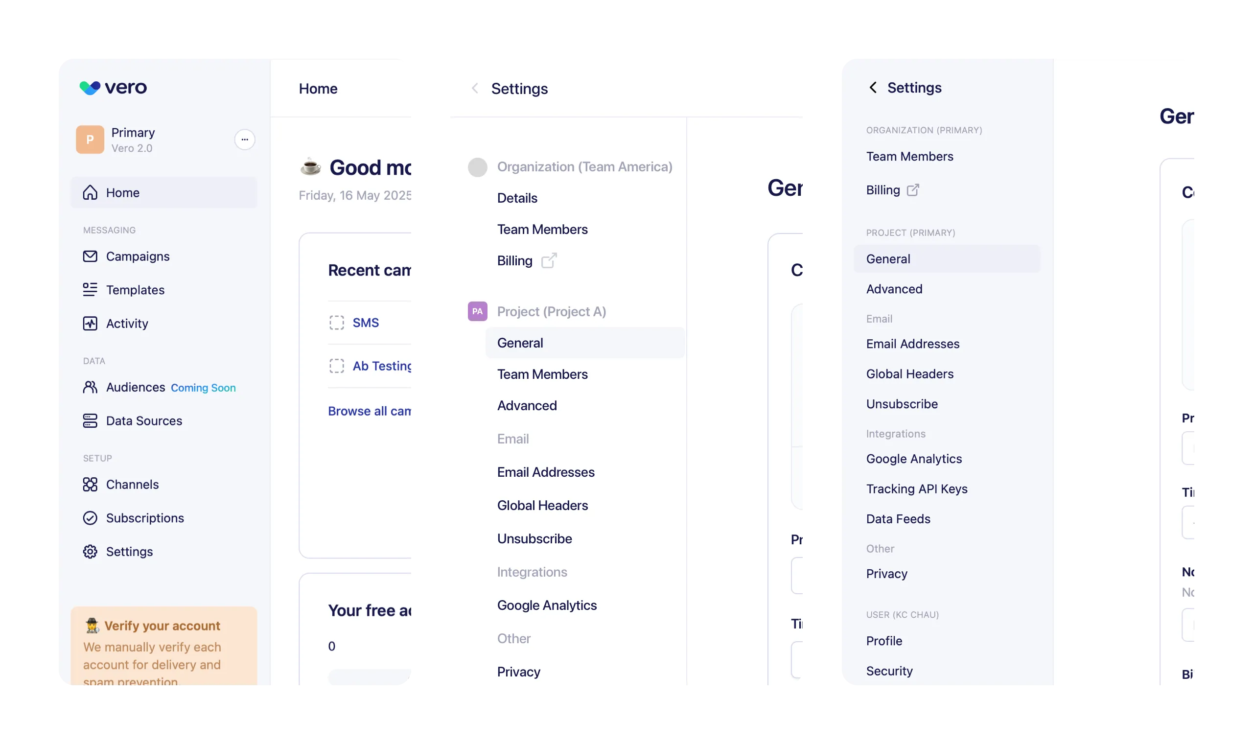
- Organize all settings into a clear, logical structure.
- Improve navigation and clarity.
- Use consistent design patterns for every setting type.
- Build a scalable system for future features.
Process
Research
At the time, Vero 2.0 had a small user base. This created a low-risk environment for iteration, allowing us to make fast, confident design decisions without needing to run large-scale UX research.
To inform those decisions, we collaborated closely with the Customer and Success teams to surface feedback. Their experience helped us identify recurring pain points and edge cases that might not have been obvious.
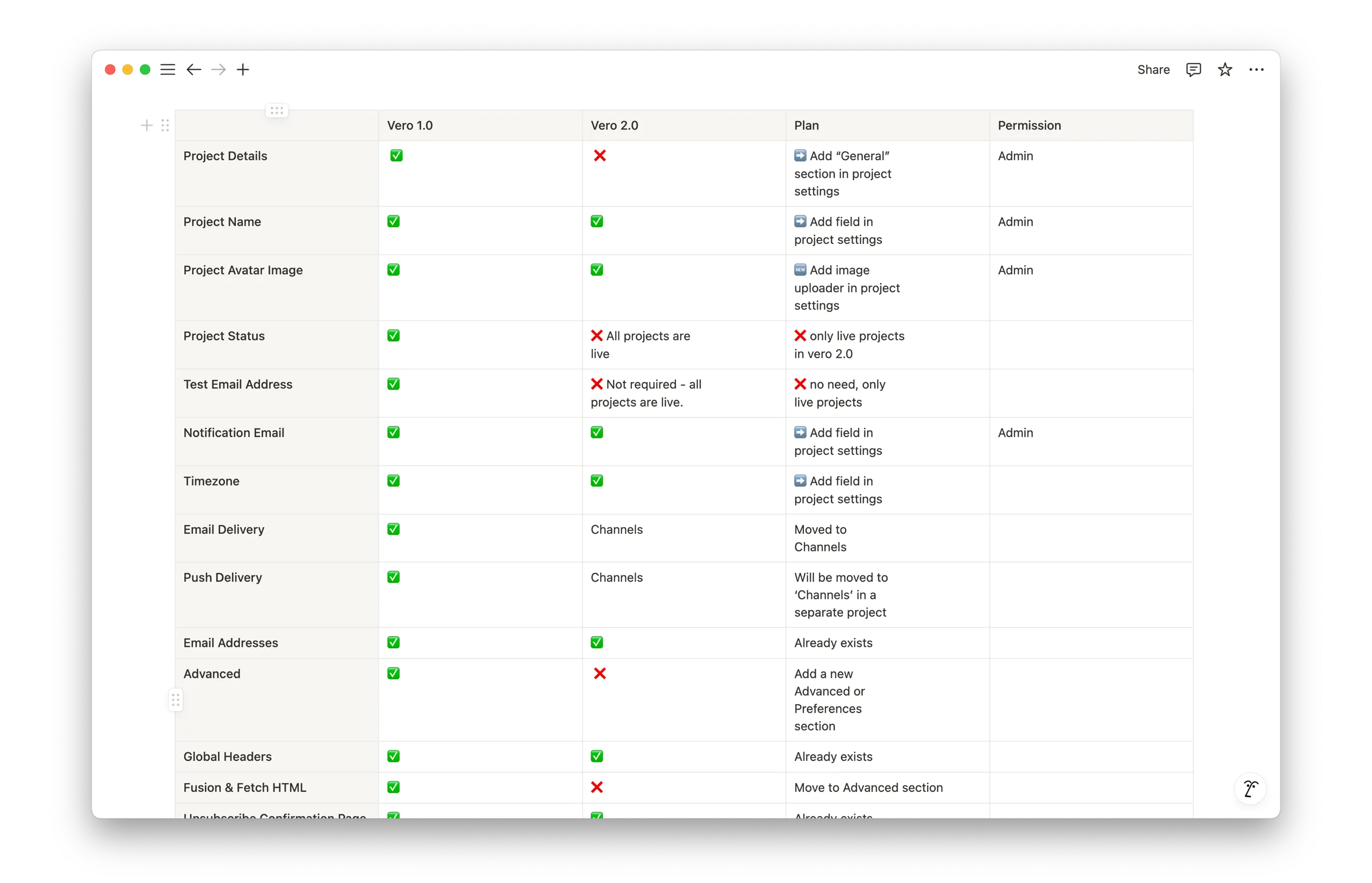
We also worked with the founder to conduct a comprehensive audit of all existing user-level and project-level settings. This was to decide which settings to migrate over from the Vero 1.0 to Vero 2.0 and which to deprecate.
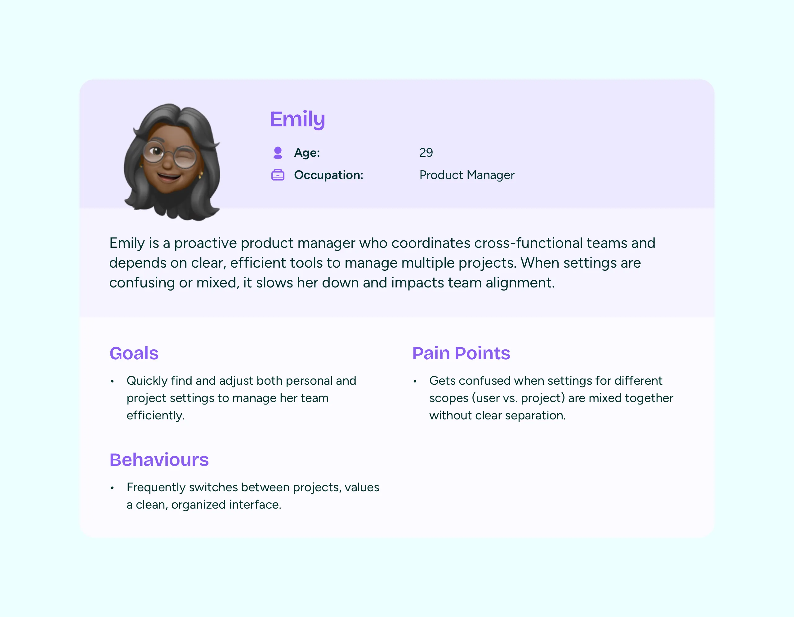
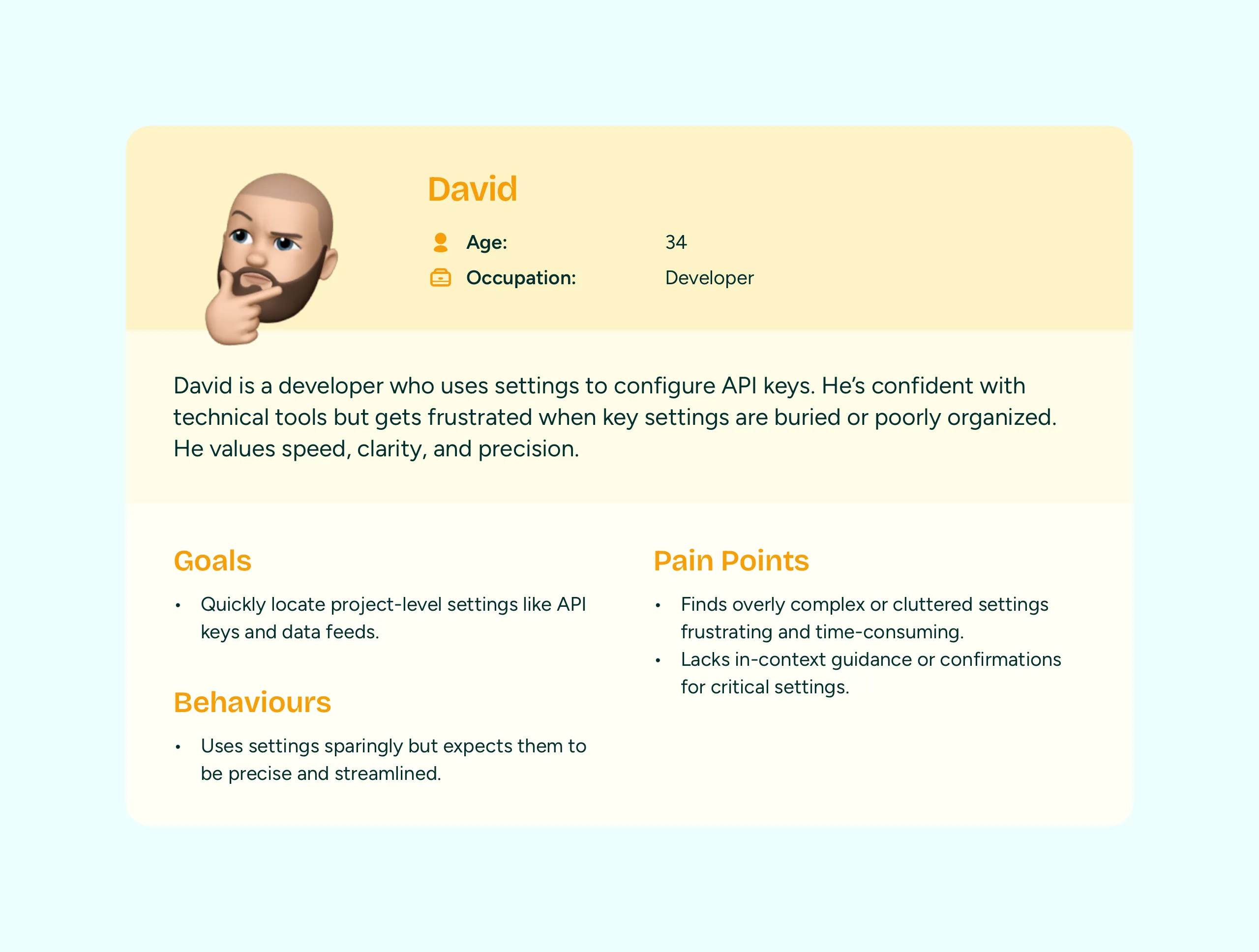
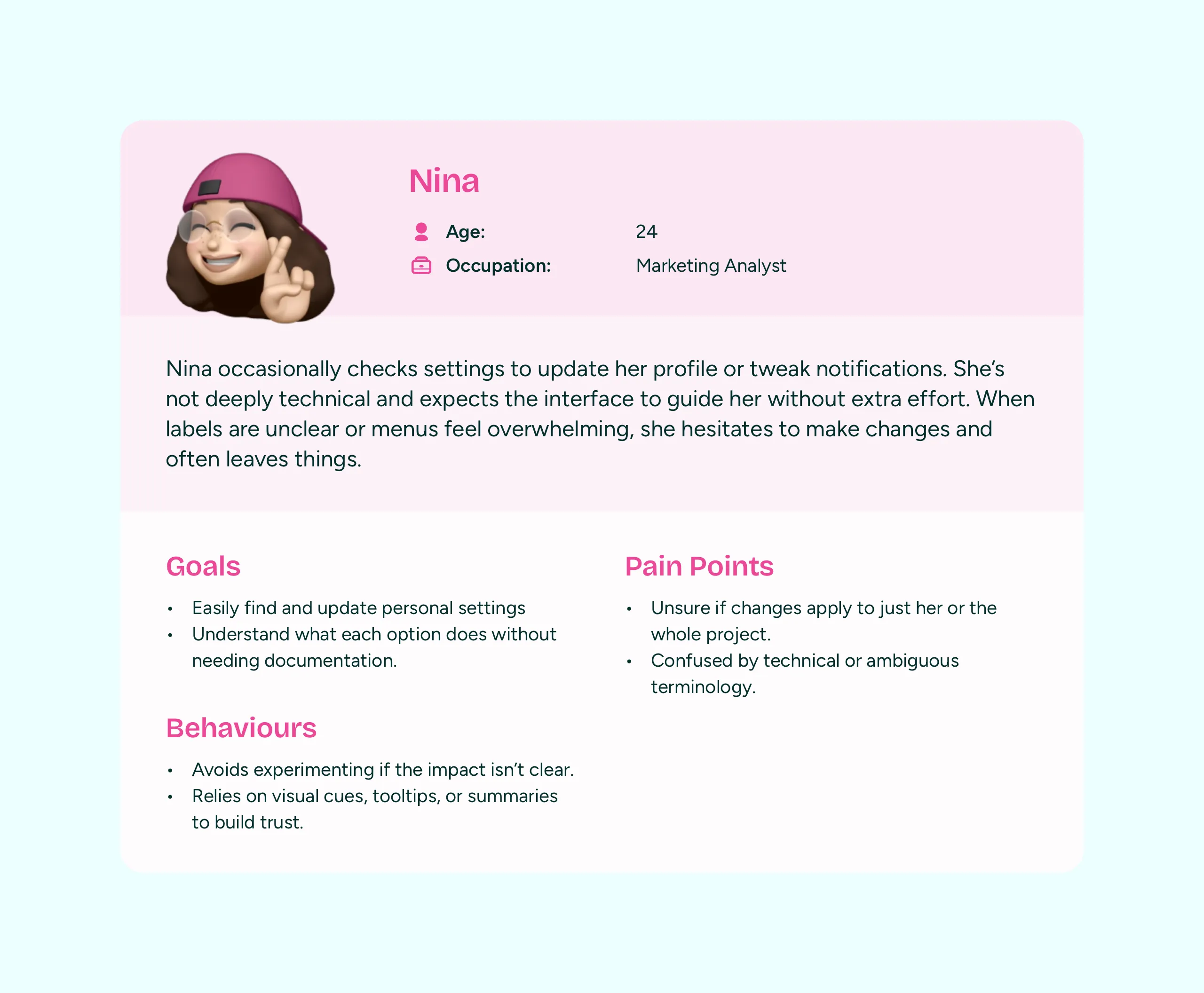
Due to time and resource constraints, I took a Lean UX approach—quickly creating lightweight user personas based on known user behaviors and context. This allowed for fast, informed design decisions without delaying the process.
Competitive analysis
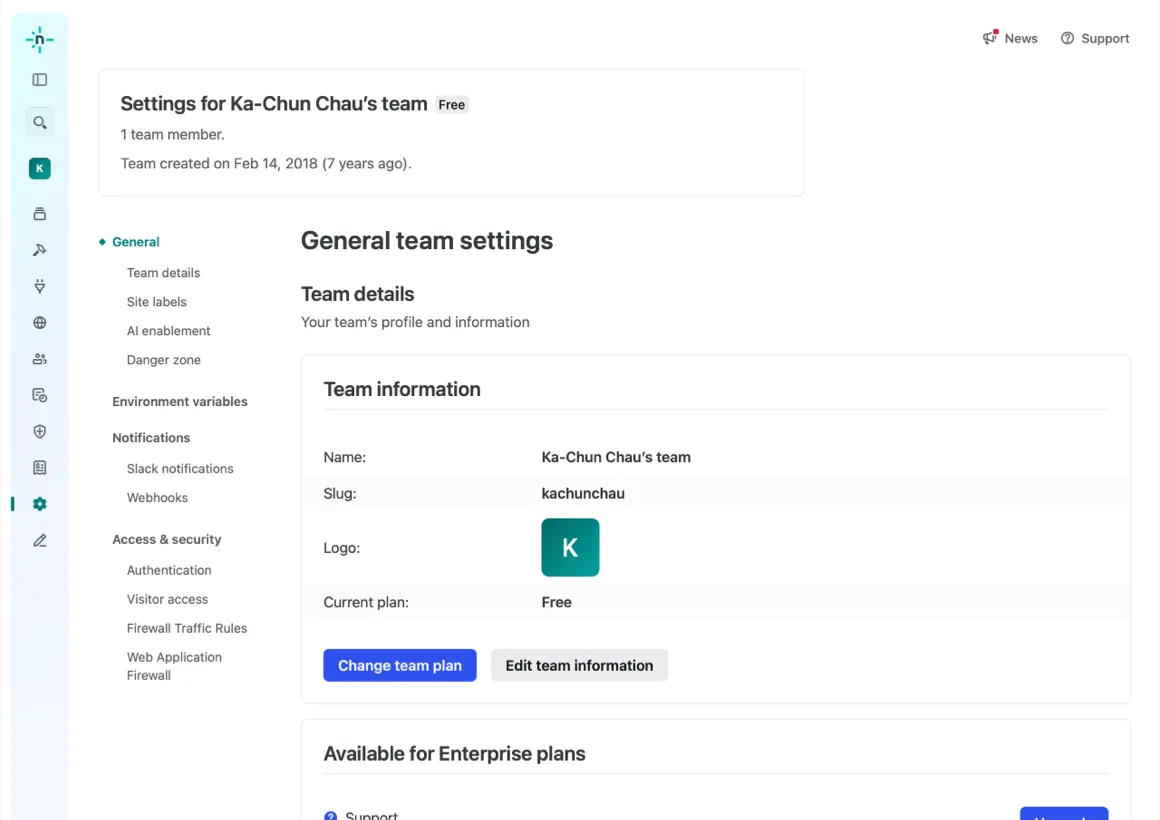
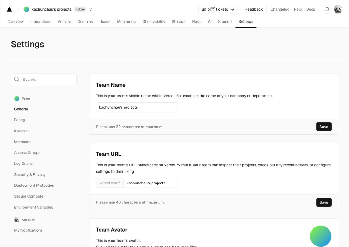
To guide our design approach, we also reviewed how tools in adjacent industries—such as Netlify and Vercel—organised their settings, drawing inspiration from proven patterns.
Exploring Designs
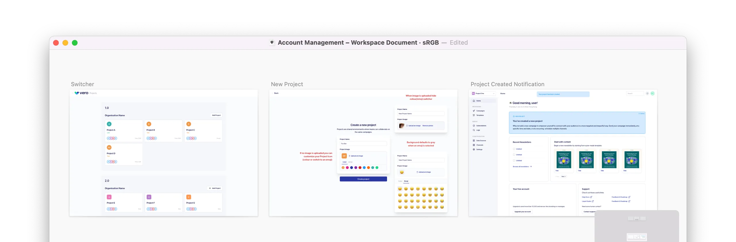
Having a Sketch component library allowed me to quickly explore mid to high-fidelity mockups, testing different ways to group and present the settings sidebar. I also explored key interaction states, including different layouts and behaviours for modals and dropdowns, to ensure consistency and usability across various settings types.
- Modal vs inline for profile settings: Should profiles open in a modal for quick access, or be embedded inline within the settings view?
- Inline vs full-screen views: Should settings open up full-screen so the new settings could also be used in Vero 1.0?
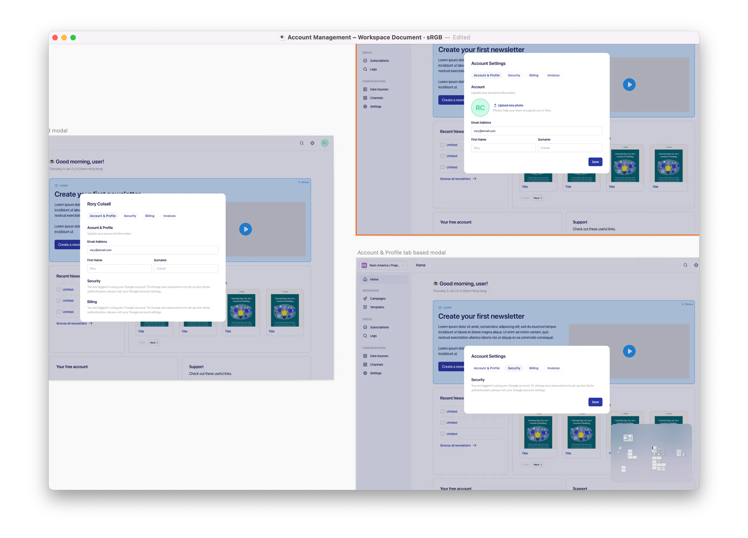
Srolling vs tabbed navigation in the account & profile modal
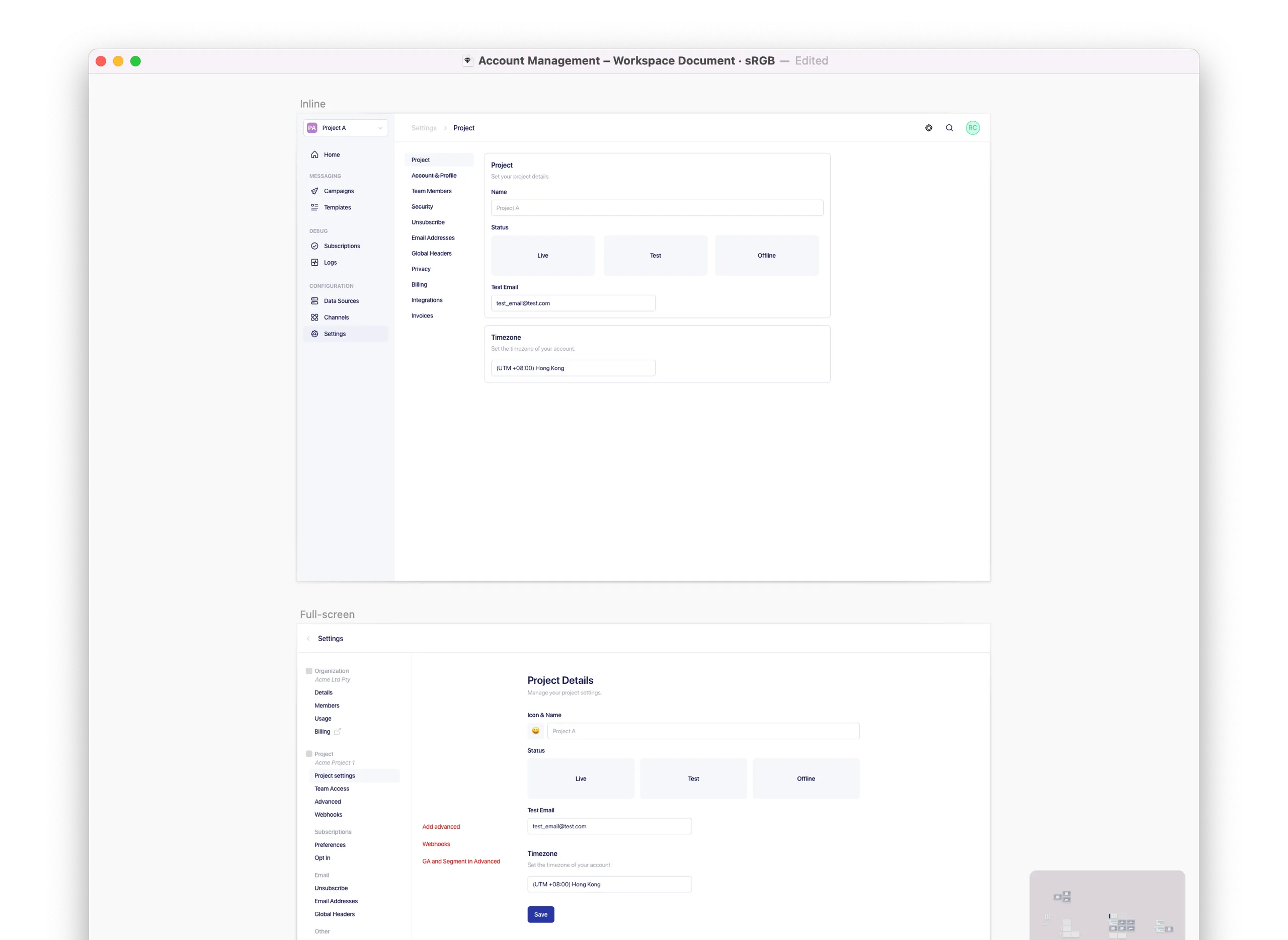
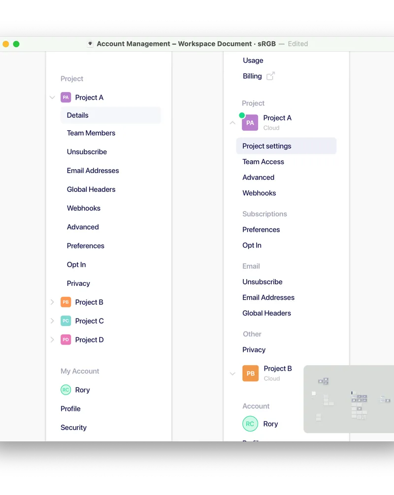
I explored ways to differentiate project-level and user-level settings, and how multiple projects should be represented in the sidebar.
I shared these mockups internally to gather feedback early. This collaborative process helped me evaluate trade-offs due to balancing business goals and technical constraints.
Concepts Not Pursued
To align with business goals, some features were moved to phase 2, allowing us to prioritise core features for a faster launch. One of these decisions included removing the ‘add new project’ feature, enabling us to deliver a leaner MVP within the 8-week timeframe.
Refining Design
I refined the mockups to balance usability, visual consistency, and technical constraints. During implementation once the bulk of the engineering work was done I jumped in to the code to do some design polish like refining spacing to ensure a more consistent and scalable experience.
Release and iterate
Post-release feedback revealed that the sidebar in the settings section felt visually disconnected from the rest of the app—due to differences in width and styling compared to the non-settings sidebar. To address this, I led a refinement of the layout by standardising the width and aligning the styles of the settings sidebar to improve visual consistency.
With a small user base, the risk of shipping small iterative changes was low and the feedback loop was fast.
What I learned
This low-risk project gave me space to focus on usability and structure without the pressure of high-stakes outcomes. It was a chance to simplify complexity, aligning UI with underlying logic, and designing for long-term scalability—all while moving quickly and collaboratively within a small team.
I identified two key metrics to evaluate success moving forward:
- Support tickets related to settings - Compare pre and post-launch support tickets.
- User-level vs Project-level - Track % of users accessing each category of settings.